Horizontal layout
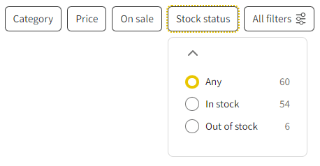
Many top e-commerces offer filters in a horizontal layout. They’re presented just above the products in the catalog. It’s a nice addition for your store. Horizontal layouts have been getting more popular recently. It might be more convenient for your customers to filter products this way. Moreover, they will definitely notice filters, which is often tricky with sidebars.
Key benefits
-

Space Saver
-

Modern Solution
-

More Convenient Filtering
Nice addition for your store
-
Space-saver
In the horizontal layout, filters are presented in a headings-only view. To use the filter, customers have to click the headings, and a convenient dropdown appears. It is a real space-saver, crucial for small mobile screens.
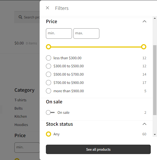
To squeeze the appearance even more, you can set up a limit of for example only 4 filter-headings only. The rest of filters will only appear when customers click the “All filters” button, allowing the overlay to appear.

-
The sliding panel
A custom designed panel where customers can focus solely on filtering the catalog. In this view all filters are presented at once.

FiboFilters
Modern, UX-friendly filtering solution for WooCommerce
Join thousands of entrepreneurs who’ve already trusted Fibo plugins.


