Before proceeding, make sure you have already added the filters in the filters builder.
There are several ways to display filters in your online store. The most popular method is to embed the filters in the sidebar. You can also place them as horizontal filters located above the product grid. Alternatively, you can use a shortcode, block editor, or other builders like Elementor to insert the filters.
Note:
Some themes have unique solutions for product filtering, which may require custom integration. Check if your theme is listed among the themes we are fully integrated with. In such cases, embedding filters may look slightly different than the standard method.
Table of Contents
- Adding filters to your site
- Filter layouts
- Changing the filter layout depending on the screen size
- FAQ
Adding filters to your site
First, you need to decide if you want filters to be displayed in the sidebar, above the products or in another, custom area. This decision determines how filters should be embedded on the site.
To select filters location, go to general WooCommerce settings → FiboFilters → General tab → find the “Filters location” option.
Three locations are available:
- Sidebar
- Above the products
- Custom location
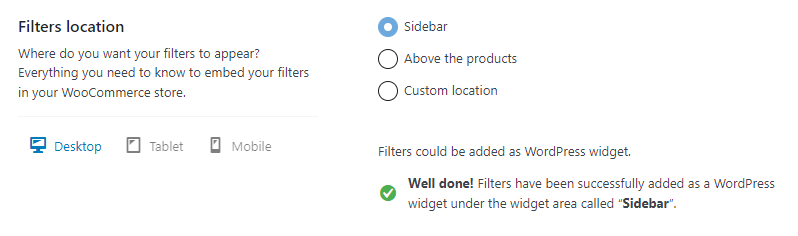
After selecting the desired location, you’ll be presented with hints to help you add filters. Now go to the guide related to the location you have chosen to learn more.
- If you chose “Sidebar” go to the “Filter location – sidebar” guide.
- If you chose “Above the products” go to the “Filter location – above the products” guide.
- If you chose “Custom location” go to the “Filter location – custom location” guide.
Filter layouts
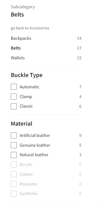
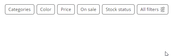
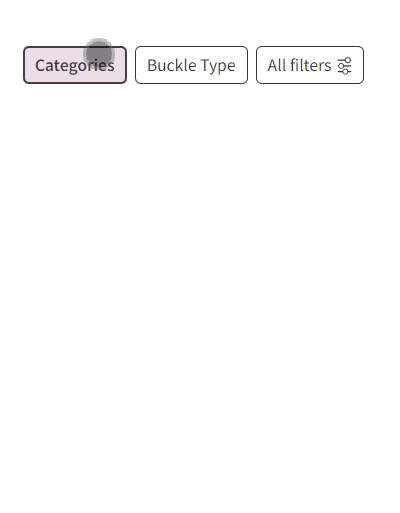
Filters can be displayed in 3 different layouts:
- vertical
- horizontal
- mobile
These layouts, by default, overlap. That means that for example you can use the vertical layouts on desktops, the horizontal on tablets, and the mobile on mobile devices.
The mobile layout is a variation of the horizontal layout, yet more refined to better fit mobile devices.
Vertical layout
Horizontal layout
Mobile layout
Changing the filter layout depending on the screen size
By selecting “Sidebar” and embedding filters according to the manual, the filters are displayed in the sidebar vertically. For screen sizes between 450px-768px, the filters are replaced by horizontal layout above the products. For screen sizes lower than 450px, the horizontal layout is replaced by the mobile layout.
By selecting “Above the products”, the filters are displayed in the horizontal layout for screens bigger than 450px. For smaller screens, the mobile layout is displayed instead.
If you select “Custom location”, the filters are displayed according to your custom set breakpoints.
More detailed information about changing the filter layout may be found in the corresponding sections: Sidebar, Above the products, and Custom location.
FAQ
coming soon