Over the last couple of years, an alternative to displaying filters in the sidebar has gained popularity. The filters are displayed in a horizontal layout above the products, allowing for more efficient use of space in the catalog.
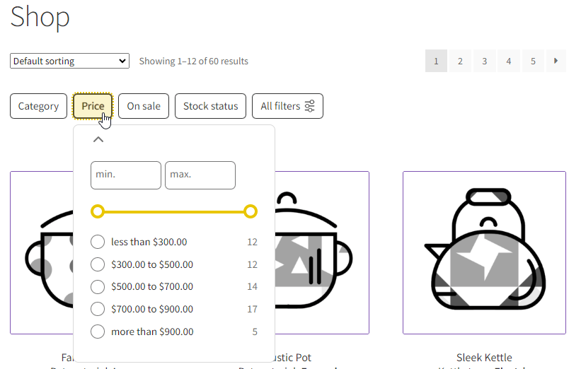
In the horizontal layout, filters are displayed as dropdown buttons above the products. The last button, labeled “All filters”, reveals the off-canvas panel with all available filters when clicked.
Benefits:
- Space-saving design
- Better discoverability and utilization of the site’s filters (more information you can find here)
Note:
On tablets and mobile devices, the horizontal filter view is enforced. These devices utilize much smaller screens and the sidebar might appear below the product catalog. It will make using filters very impractical. For example, in the Storefront theme, the sidebar drops below the products on screens smaller than 768px.
Table of Contents
- Appearance
- Enabling Horizontal Filters in FiboFilters
- Opening the filter off-canvas with a custom button
Appearance
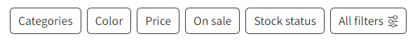
Horizontal filters are displayed directly above the product grid, as dropdown buttons.
The filters’ appearance slightly differs depending on the screen width. Horizontal filters behave differently on desktop and mobile devices, taking into account two breakpoints: 768px for tablets and 450px for mobile devices. Theme integrations may override these, and you can also modify them using PHP filters. These two breakpoints create three ranges of screen width. Below are details on how horizontal filters look and behave for both tablets and mobile.
Most themes designed for WooCommerce have predefined breakpoints that determine when the layout adjusts to a different viewport or device sizes.
The desktop view (screen width >= 768px)
- Filters are displayed above the products grid as buttons with the filter names
- Clicking the button expands a panel with the filter items
- Up to 6 filters can be shown initially
- The remaining filters are accessible by clicking the last button labeled “All filters,” which opens the off-canvas panel with all available filters
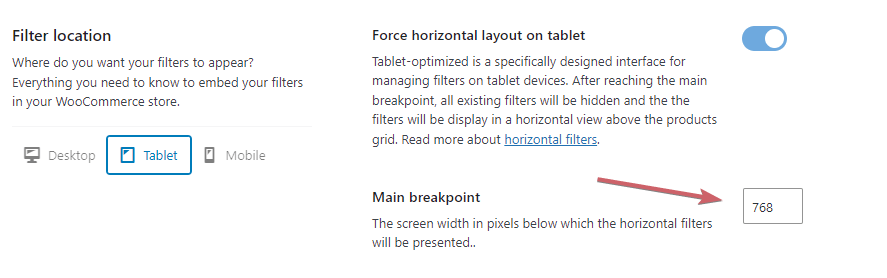
The tablet view (screen width between 450px – 767px)
- This layout utilizes a range similar to desktop devices
- If you use vertical filters (such as in a sidebar), all the filters from the sidebar will be hidden – instead, the horizontal filters appear above the products
Changing the default breakpoint for tablets or disabling this feature:
Go to WooCommerce > FiboFilters > General (tab) > Filter location and select the “Tablet” tab.
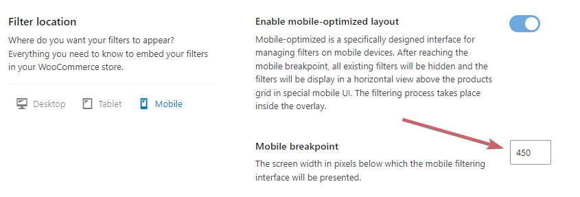
Mobile view (screen width less than 450px)
This variant of horizontal filters is also called “Mobile filters” and is described separately in the article about the mobile layout. See who is specific for this layout:
- Only a maximum of 3 buttons will appear, the first 2 with filters and the last button labeled “All filters”
- Clicking on any filter name or the “All filters” button will display a special overlay instead of an off-canvas menu – this is a specifically designed interface for managing filters on mobile devices
Changing the default breakpoint for mobile devices or disabling this feature:
Go to WooCommerce > FiboFilters > General (tab) > Filter location and select the “Mobile” tab.
Read more about mobile-optimized layout for FiboFilters.
Enabling Horizontal Filters in FiboFilters
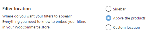
To display filters in the horizontal mode in FiboFilters, you need to enable the “Above the products” option in WooCommerce > FiboFilters > General (tab) > Filter location.
After selecting this option, the filters will be added above the product grid. We use the action hook named woocommerce_before_shop_loop with a priority of 500 for this purpose.
When you select the filter location as “Sidebar”, the horizontal layout will be displayed on screen width from 450px to 768px, and the mobile layout on screen width less than 450px by default.
After selecting “Custom location” you have to set everything manually using shortcodes or blocks.
Change the number of buttons
On desktop, horizontal filters by default are shown as 5 buttons with filter labels + an additional one that opens the off-canvas, labeled “All filters”. On mobile devices, it changes to two buttons + an additional “All filters” button.
You can adjust the number of the buttons for all device types. Selecting a value of “0” will hide all other filter buttons except “All filters”. See the following examples:
Example 1: Hide all buttons except “All filters”:
add_filter( 'fibofilters/config/horizontal_max_buttons', fn() => 0);
add_filter( 'fibofilters/config/mobile_max_buttons', fn() => 0);
ⓘLearn how to add this snippet to your WordPress.
Example 2: Show 8 filter buttons on desktop, and 3 filter buttons on mobile: + the “All filters”:
add_filter( 'fibofilters/config/horizontal_max_buttons', fn() => 8);
add_filter( 'fibofilters/config/mobile_max_buttons', fn() => 3);
ⓘLearn how to add this snippet to your WordPress.
Opening the filter off-canvas with a custom button
Starting from FiboFilters 1.10.0, you can trigger the filter off-canvas panel using your own custom button.
To open the off-canvas panel programmatically, simply add the data-fibofilters="open-offcanvas" attribute to your custom button element. Here’s an example:
<button data-fibofilters="open-offcanvas">
  Open off-canvas
</button>
This button will trigger the filter panel just like the built-in control.
You can also open the off-canvas with JavaScript. Check here how to do it.