After selecting this location, you’ll be presented with hints on how to add filters to the sidebar in your theme. These instructions are theme-dependent. If an integration with the active theme is not yet in place, you have to add filters with a FiboFilters block – please review this section to learn how to do it.
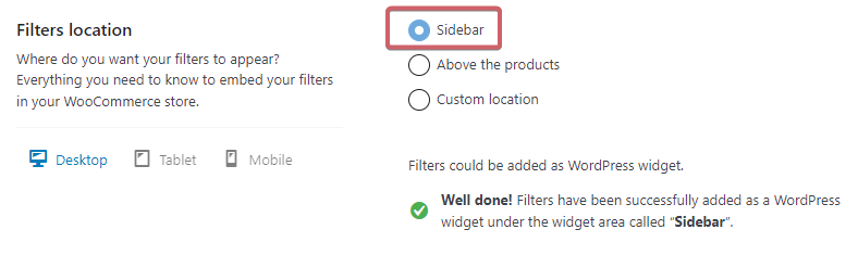
Table of Contents
- Adding a widget with filters to the sidebar
- Changing the filter layout depending on the screen size
- Force horizontal layout on tablets
- Enable the mobile-optimized layout
Adding a widget with filters to the sidebar
Step 1
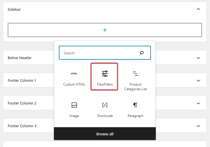
Navigate to Appearance -> Widgets
Step 2
Add the FiboFilters block to the proper widget area. Find the FiboFilters block and drag it to the desired widget area. The specific widget area where FiboFilters might be presented depends on the theme you’re using. For example, in the Storefront theme, it will be the widget area named “Sidebar”:
Step 3
Next, go to WooCommerce -> FiboFilters -> General (tab) in your WordPress dashboard.
Step 4
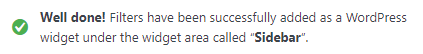
If you have successfully added the FiboFilters widget, you should see the “Well done” message:
Changing the filter layout depending on the screen size
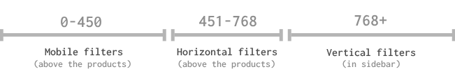
Filters in the sidebar are automatically hidden if they meet the “Main Breakpoint”, which is 768px by default. After that, the filters are displayed in the horizontal layout above the products. On screens smaller than 450px, the horizontal filters are replaced by the mobile filters – similar to the horizontal layout, however more refined to suit mobile devices.
The transitions are described in the post about horizontal filters. Please use this visual hint too:
You can manage the transitions by clicking on the respective “Tablet” and “Mobile” tabs. Take note: breakpoints can be overwritten by theme integrations.
Force horizontal layout on tablets
You’ll see two options in the “Tablet” tab:
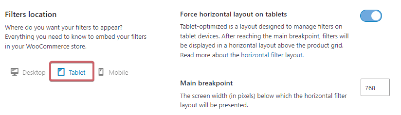
- Force horizontal layout on tablets – this option is the default tablet setting; only the horizontal layout above the products will be displayed for screen sizes between 450px and 768px
- Main breakpoint – you can set up the default breakpoint, which is set to 768px
Enable the mobile-optimized layout
You’ll see two option in the “Mobile” tab:
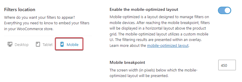
- Enable the mobile-optimizes layout – this option is the default setting for mobile devices; only the mobile-optimized layout will be displayed for screen sizes lower than 450px
- Mobile breakpoint – you can set up the default breakpoint, which is set to 450px